DUI
Add React components through the shadcn registry, then edit the source directly in your application.
- Account
- qentrah
- License
- MIT
- Technology
- TypeScript
- Status
- Public repository
About DUI
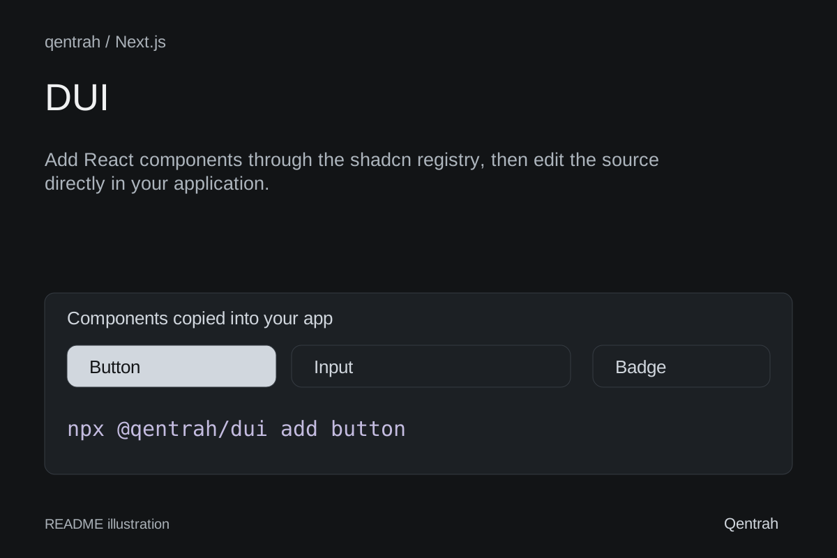
Add React components through the shadcn registry, then edit the source directly in your application.
Original project pageInstall & get started
npx @qentrah/dui init
npx @qentrah/dui add buttonFrom the repository
DUI
An open-source React component library and shadcn registry.
DUI is the design system and shadcn registry maintained by qentrah. Components are copied into your application as source code, so your team owns every line and can adapt the system without adding a runtime UI-library dependency.
Why DUI?
- Distributed through the shadcn CLI
- Zinc-first design tokens with accessible dark surfaces
- TypeScript and Tailwind CSS
- Supports LTR and RTL layouts
- Components remain inside your application and under your control
- Open source under the MIT License
Install
Initialize shadcn in an existing React project:
npx @qentrah/dui initAdd a DUI component using the npm shortcut:
npx @qentrah/dui add buttonYou can also use the shadcn CLI directly:
npx shadcn@latest add qentrah/DUI/buttonYou can install multiple items:
npx @qentrah/dui add button input cardPreview an installation without writing files:
npx @qentrah/dui add button --dry-runPin a release or commit for reproducible installations:
npx shadcn@latest add qentrah/DUI/button#v0.1.0Components
Foundations
buttoninputtextareacheckboxswitchbadgecardalertavatarprogressseparatorskeletonspinner
Product primitives
filter-chipstatus-pillempty-statecolor-dottag-chiplegend-itemlist-rowlist-itemcolor-swatchstatus-badgedepartment-dot
Application components
video-playerbannercustom-bannercode-viewerresizablecomposerai-composersearch-inputmenudropdownsidebarmobile-navmodalpopovercharttablecursor
Motion plugins
css-motiongsap-motionmotion-reveal
Blocks
blocks-sign-inblocks-sign-in-cssblocks-sign-in-gsapblocks-sessionblocks-color-filterblocks-hero-simpleblocks-hero-centeredblocks-cta-sectionblocks-feature-gridblocks-gallery-mosaicblocks-photo-storyblocks-testimonial-sectionblocks-testimonial-gridblocks-logo-cloudblocks-local-logo-wallblocks-faq-section
Blocks install their declared DUI primitives automatically. Motion-enhanced variants are separate registry entries, so products can start with the normal block and opt into CSS or GSAP only when needed.
The source of truth is registry.json. Built registry payloads are generated in public/r.
Direction support
DUI components use logical layout utilities wherever direction matters. Set the document direction at the application boundary:
<html dir="rtl">
<body>{children}</body>
</html>For left-to-right layouts:
<html dir="ltr">
<body>{children}</body>
</html>Local development
Requirements:
- Node.js 20 or newer
- npm 10 or newer
git clone https://github.com/qentrah/DUI.git
cd DUI
npm install
npm run devOpen http://localhost:3000.
Before submitting a change:
npm run lint
npm run build
npm run registry:build
npm run registry:validateRegistry structure
app/ Documentation website
components/ui/ Installable component source
components/library/ Documentation previews
lib/ Shared utilities and catalogs
public/r/ Generated registry payloads
registry.json Registry source of truth
components.json Local shadcn configurationWhen adding an installable component:
- Add its source to
components/ui. - Declare the item and dependencies in
registry.json. - Add its documentation metadata to
lib/catalog.ts. - Add a preview and example source.
- Build and validate the registry.
Contributing
Contributions are welcome. Read CONTRIBUTING.md before opening a pull request. By participating, you agree to follow the CODE_OF_CONDUCT.md.
For security issues, follow the private reporting process in SECURITY.md.
License
DUI is available under the MIT License.